Hello world.
In the beginning it was chaos.
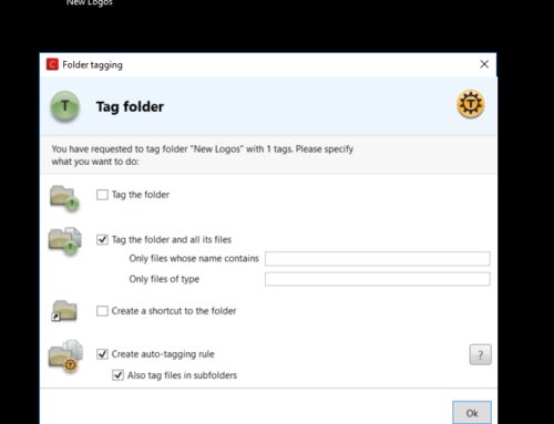
Initially we had many different ideas, a lot of confusion in our heads and one goal: “be revolutionary user-friendly => be different from everything else”.
This is a very first mockup done by me on a cold scandinavian night in December 2008:
.jpg)
And at the same time we sketched a few crazy ideas on paper:
.JPG)
.JPG)
.JPG)
One more mockup, done in another freezing scandinavian nuight, one month later:

Then came ZUI, direct manipulation, vector graphics and Utopia.
Those are the very first prototypes of Tabbles, which few people has seen (February 2009 until May 2009):
.jpg)
.JPG)
At this point we were heavily focusing on ZUI, and vector graphics. Most of the graphics (including the button icons!) was vectorial and done in XAML. Why made that choice, is not 100% clear to us yet 🙂
One of the features we were more proud of was the so called “butterfly” (which existed in 3 different shapes until the version 1.1.something and we plan to revive it as undisclosed point).
The purpose of the butterfly was to allow the user to perform operation directly on the object without going through a sub-menu (so called direct manipulation) or using the right-mouse button (widely criticised in the late 80’s).
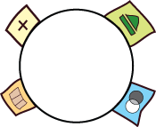
One of the first ones (from January 2009) looked pretty cartoonish:
In February the butterfly looked a lot like an atom (from Illustrator):
.JPG)
.JPG)
…a few mockups later…
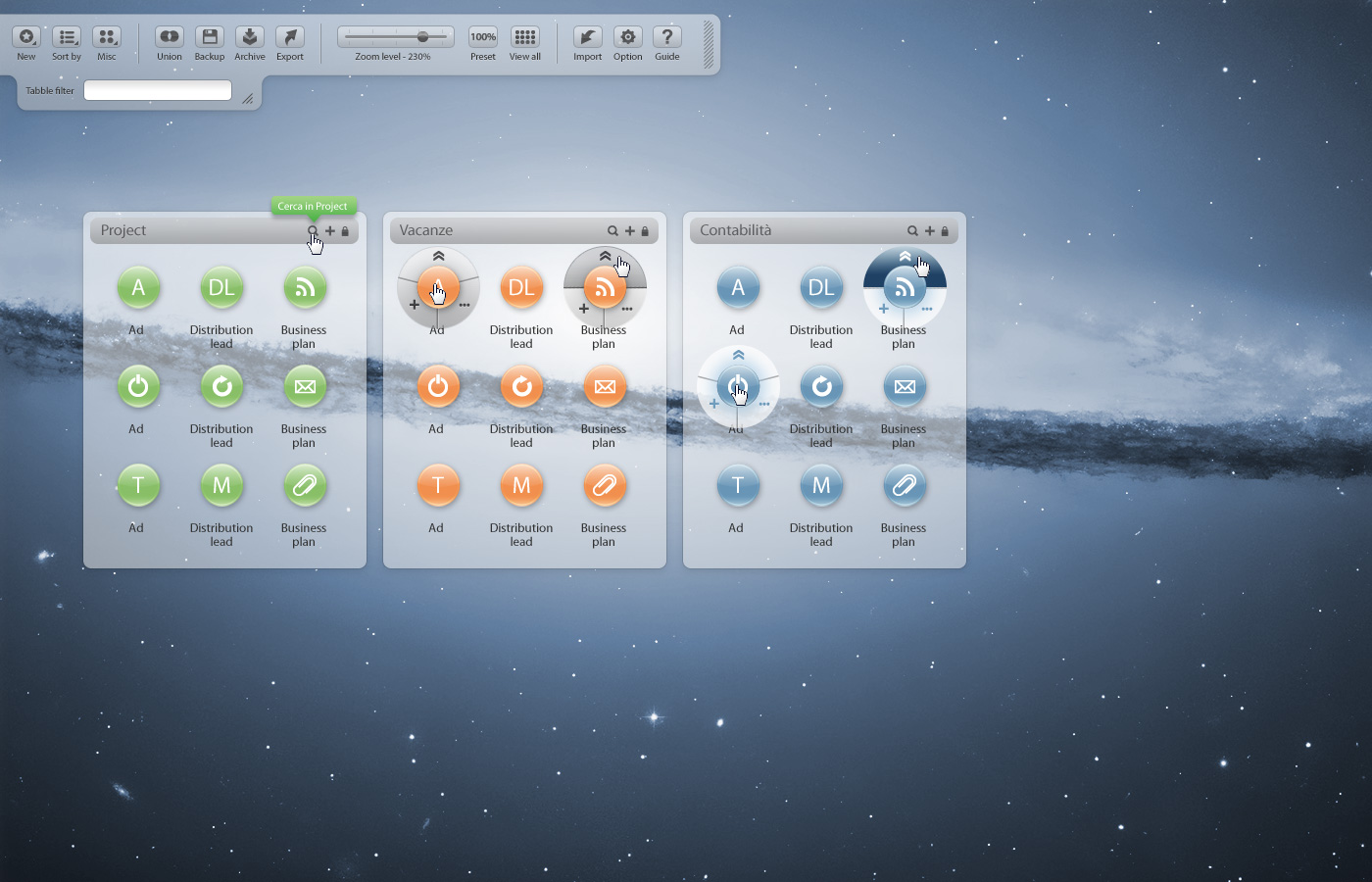
…Tabbles started to get its identity. While I’m writing this post, I’m looking at the app on my screen and you might say that the following shots do not look at all like what we have now. Well, it looks different but some key elements where there already: most of the icons with their minimalist design, the grey gradient, the zoom bar, the separation between tabbles level and file level. Plus all the main features such as the zooming+panning paradigm, which was pervasively deployed wherever possible.
Here is one out of many crazy mockups done in the first half of 2009:
.jpg)
This design never made it into development (thank GOD!) as its space-efficiency would have been extremely poor… apart of being plain ugly. This is what Tabbles looked like in those days:
.JPG)
.jpg)
.jpg)
Being aware of our limits, at some point we asked my younger brother to help us finding a decent designer to design our homepage and to fine-tune our GUI. He initially babbled something like “yeah, hmm, you know…”. After a couple of weeks he came out with a statement that sounded like “well, if you want I can get you the best guy in town, but it won’t be cheap…”. The town was Rome, and the guy was Marco Marini.
Marco lives on a space-ship and he typically hangs around riding a flyng-dragon and wearing a shiny Mithril armor. We met him for the first in February 2009 and showed him what we had at that point. It took him a while to send us a couple of mockups as while he was working for us (pennyless garage-based developers), he was also working – among the others – on the rai.it website (the italian public tv website). He designed our homepage, our logos and re-designed our GUI.
In May we received the first mockups from him of the redesigned GUI….for the next few weeks we simply couldn’t stop drooling :


[since we’re 3 nice guys investing their own money (!) we got a very friendly price (which I was kindly asked not to disclose) 🙂 ]
This major upwards shift in the GUI did obviously push us towards new directions. Me and Maurizio would have never been able to produce graphics with this level of care… The new mockup had beautiful 3D effects everywhere, neat shadows, rounded shapes and reflections, definitely a few meters above the best mockups we did ourselves.
The challenge was now going from .psd to WPF!
Plus, the mockups were based on an early version of Tabbles, as things evolved (and they did pretty quickly) most of the buttons in the mockup were doomed to oblivion…
Let’s start with the basic: the new tabble + butterfly in illustrator looked like this:

And obviously the XAML that came out of this monster wasn’t exactly what Expression blend and Visual Studio were expecting to get… It had to be redone as most of the stuff we got.
But of course we knew that things weren’t supposed to be easy and we didn’t even consider giving up on the GUI! 🙂
Therefore, The next versions of Tabbles looked like this:
.jpg)
.jpg)
.jpg)
1st of August: release-time
Surprisingly for everybody (that is: we, ourselves and us), we made it and released the 1.0 roughly when we scheduled it 1 year earlier, long before the first lines of code were written. Of course 2/3 of the features were missing and the 1/3 that was there would crash as only you’d look at it a bit too intensely… but hey, if Microsoft can do it, why can’t we? 🙂
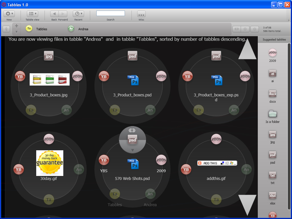
The shots of the 1.0 version are still on our website in the screenshots page and the videos are on youtube. Anyway this is what the 1.0 looked like:


Cool! What’s next?
While I’m writing this, we’re at 1.3.10 RC1: we’re working on an alternative view mode that doesn’t require the user to zoom and pan. Else, we’re keeping our beloved community informed using this forum post.
The story goes on here
Questions? Comments? They’re all very welcome! This is us and this how you can contact us.
P.S.: Marco was kind enough to design a couple of decent logos for us 🙂
[…] integrate itself with Windows Explorer, and instead acts as an Explorer replacement. Tabbles was designed from ground up to look good and look good it does. The interface is slick enough to grab attention […]
[…] The Evolution of a GUI and the Pulsating Life of a UX […]
[…] The Evolution of a GUI and the Pulsating Life of a UX РаÑÑказ о пÑ?оÑ?еÑÑе пÑ?оекÑ?иÑ?Ð¾Ð²Ð°Ð½Ð¸Ñ Ð¸ дизайна наÑÑ?олÑ?ного Ñ?айл-менеджеÑ?а Tabbles. Ð?оказано много пÑ?омежÑ?Ñ?оÑ?нÑ?Ñ? конÑ?епÑ?ий инÑ?еÑ?Ñ?ейÑа, Ñ?Ñ?о позволÑеÑ? Ñ?видеÑ?Ñ? Ñ?азвиÑ?ие идеи. […]
[…] The Evolution of a GUI and the Pulsating Life of a UX РаÑÑказ о пÑ?оÑ?еÑÑе пÑ?оекÑ?иÑ?Ð¾Ð²Ð°Ð½Ð¸Ñ Ð¸ дизайна наÑÑ?олÑ?ного Ñ?айл-менеджеÑ?а Tabbles. Ð?оказано много пÑ?омежÑ?Ñ?оÑ?нÑ?Ñ? конÑ?епÑ?ий инÑ?еÑ?Ñ?ейÑа, Ñ?Ñ?о позволÑеÑ? Ñ?видеÑ?Ñ? Ñ?азвиÑ?ие идеи. […]
[…] reading: The developers have an insightful post detailing the evolution of their GUI design for Tabbles that’s well worth a look for any UX […]
[…] The evolution of a GUI and the pulsating life of a UX […]
[…] reading: The developers have an insightful post detailing the evolution of their GUI design for Tabbles that’s well worth a look for any UX […]